Inked most of pages up, now just for adding colour. Decided to use a limited colour palette so you don't get too bogged down with colour and detail when you read it.
Here's two pages, when the comic is in printed form, they will read as a double page spread.
These are still only drafts, so they could end up changing and getting redone by the time I colour the rest of the pages.
Showing posts with label Narrative. Show all posts
Monday, 29 October 2012
New Draft pages.
Labels:
Abuse,
Colour,
Comic book,
Drafts,
Illustration,
Narrative,
Photoshop,
Woman
Sunday, 30 September 2012
Page 2 Teaser!
Labels:
Abuse,
Colour,
Comic book,
Drawing,
Graphic Novel,
Illustration,
Ink,
Narrative,
Photoshop,
UWE
Wednesday, 26 September 2012
First Original Comic.
Taken some time recently and sat drawing and finalizing my Domestic Abuse comic from University (Title still to be decided....any ideas?)
Gotten a few pages drawn up, colouring them inbetween my searches for employment. Two pages basically done.
Hope you enjoy the teaser above.
Thursday, 15 March 2012
Business Card ideas.
For the past two days I've been designing business cards. On them I want to display or at least list the things I can be commissioned to do. I've come up with the idea of using a comic strip.
Evetually, I will display the postcard/business card as they are supposed to be seen; but these are the panels I've come up with so far. For the 'typography ninja' panel, I stuck as to whether to include the blackoutline or take it out completely. Suggestions?
(Right click and select 'open in new tab/window' to view big)
Evetually, I will display the postcard/business card as they are supposed to be seen; but these are the panels I've come up with so far. For the 'typography ninja' panel, I stuck as to whether to include the blackoutline or take it out completely. Suggestions?
(Right click and select 'open in new tab/window' to view big)
![]() |
![]() |
| With Black outline. |
![]() |
| Without Black outline. |
Labels:
business card,
Comic book,
Illustration,
Narrative,
Photoshop
Wednesday, 7 December 2011
Currently doing my dissertation at the moment, so I haven't really had time to do my main work, but next week is had in day, so I can get back to drawing soon. In the meantime, have some photographs of my studio space and work I have done.
My University studio space needs a bit of a tidy up, towards the bottom you'll notice some other artists work I use as inspiration, they include: Becky Cloonan, Yuko Ota (from Johnny Wander) and Sam Bosma.
The other two photographs are of one of my draft pages for my domestic abuse based comic.
Monday, 21 November 2011
Panels.
Finally thought of an idea for a few panels to go towards a comic/fanzine. I done a quick test of colours/style of colouring on the two panels below.
Labels:
Abuse,
Applied,
Art,
Bristol,
Colour,
Comic book,
DAA,
Drawing,
Graphic Novel,
Narrative,
Panels,
Photoshop,
University,
UWE
Friday, 11 November 2011
Newspapers.
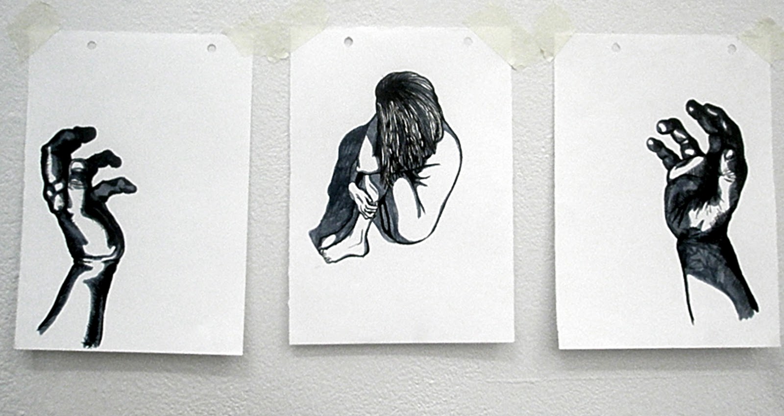
I spent today pretty much doing intensely detailed doodling, in order to waste time until my tutorial at 14:15 in the afternoon. Drew two hands on separate paper, using the same graphic style as before but including some more detailed crosshatching; then went on to draw some hands bound together. I left the last illustration in black and white because I think it made a bigger impact as it was instead of adding in the blue/grey colouring.
After finishing these, I decided to shift everything about on my studio wall, I discovered that the separate hands worked really well when combined with the illustration 'Shame.'
After much 'faffing' with my work, I had my one to one with Ian Chamberlain. These are the quick notes I took from that tutorial:
- Domestic Violence? More people can relate and have experienced.
Can also use my own experiences with it. - Can see my style of work in a Graphic novel/fanzine/printmaking.
- Look into current news rather than vague historical events e.g. Chikatilo.
- Perhaps take current event from newspaper and illustrate. e.g. M5 crash near Taunton.
- Or look into major historic events and adapt into comic form e.g 300/ From Hell.
- Keep a narrative.
With this tutorial I discovered I was at a bit of a crossroads with my work. I didn't really have a concept, other than keeping a narrative; I didn't really know where to move onto, although through my research I had discovered what I was interested in: control, power, and the edges of morality.
I will continue with research but perhaps keep too more contemporary and 'conventional' issues rather than serial killers.
Monday, 7 November 2011
Joint.
My last seminar at University on the 28th of October was partly useful, partly confusing.
I was told by my peers that the pencil drawing 'Captive' was too sexual, something I already knew. However, they made some valid evaluations about the small graphic/comic styled illustrations and confirmed what I had thought:
The last one I wasn't too keen on because it starts to lose a narrative when it is just of rope, however using an image of rope and juxtaposing it with another image appealed, and so I experimented with juxtaposition.
In the seminar, they also suggested going back to using pencil instead of brush pens and ink, however I enjoying using them far too much to go completely back to using just pencil.
While I thought of the comments my peers said were great and useful towards the techniques of my work, I didn't recieve anything helpful about the concept or undertone of my work, and so I am starting to feel a little lost about how to move on from the above.
I was told by my peers that the pencil drawing 'Captive' was too sexual, something I already knew. However, they made some valid evaluations about the small graphic/comic styled illustrations and confirmed what I had thought:
- A narrative/storyline is being read
- Small and frantic- adding to disturbing-more dark imagery.
- Colour adds more humanity- reds really grabs you- evokes danger quality.
- Undergrowth wrapping around victims- disappearing- buried = creepy.
- Which Side of the line am I looking at?
- Observational or experience.
- Control- not just physical, can be emotional.
- E.g. Domestic violence/abuse
- Juxtapose images- suggest rather than shout.
- Perhaps look at rope, tape and cable ties- again suggest with images of just rope instead of tied up women etc.
The last one I wasn't too keen on because it starts to lose a narrative when it is just of rope, however using an image of rope and juxtaposing it with another image appealed, and so I experimented with juxtaposition.
![]() |
| Rope. Draft. Nov 2011. |
![]() |
| Rope. Nov 2011 |
![]() |
| Shame. Nov 2011 |
![]() |
| Restrain. Nov 2011. |
Sorry about the image quality, the photographs were taken with the camera on my phone.
In the seminar, they also suggested going back to using pencil instead of brush pens and ink, however I enjoying using them far too much to go completely back to using just pencil.
While I thought of the comments my peers said were great and useful towards the techniques of my work, I didn't recieve anything helpful about the concept or undertone of my work, and so I am starting to feel a little lost about how to move on from the above.
Subscribe to:
Posts (Atom)