I've spent most of my day today typesetting the first Charon Continuum chapter (Written by Dominic Archer and available to read online for free here) for viewing online and then re-editing it for the Kindle, when it eventually gets published on there.
My poster illustration from the post before is actually being used as the front cover. (Yay!)
I've actually really enjoyed working on the Charon Continuum, but I feel I might have to take a step back for a bit, because I feel like I haven't worked on my own projects in a while, through no fault but my own of course.
So far, in my sketchbooks I have three fully scripted out mini comics to draw up; further journal comics to do; as well as the main Graphic novel I'd like to finish scripting and then actually draw. So, yeah....a lot to be getting on with really.

Showing posts with label Comic book. Show all posts
Showing posts with label Comic book. Show all posts
Thursday, 13 June 2013


Saturday, 20 April 2013
Charon Continuum
It's been a bit of manic day again today. Been doing a fair bit of design work for the Charon Continuum Project, which I'm part off.
Generally, I've taken a bit of an Admin/Organisational role for the project, but the website needed a bit of work to look nicer and we're in need of some posters and postcards to hand out for recruitment.
First, I sorted out the Wordpress site; it looked a bit of a mess. A little bit confusing, and not very user friendly. I changed the theme sorted out some settings, then I made a new header (below) for it.
I tried to make the header a bit Sci-Fi but also kind of 'trendy' and simple. I think it came out nicely considering I only done it all quickly this morning.

Now I'm working on the postcards/flyers to hand out at conventions and events this year. I'm trying to get at least one design completely finished before the start of May, so we can get them printed to hand out at the Bristol Comic Expo on the 11th-12th of May.
I've worked about 10 thumbnails so far, still need to do a few more, but I'm happy enough with one of the designs to carry on with for now.
It's a fairly simple design, copying the format of a newspaper, displaying both the subject of the first short story of the project and also all the needed information for new recruits and readers. Here's a screenshot of it in progress.

Saturday, 2 March 2013
Dino Love

Started a new comic today, its about Love and Dinosaurs.
Above is the first page, I've left out the dialogue for now, to keep the story a bit of a mystery.
Wednesday, 23 January 2013
Chuffed.

I've had this lineart saved my computer for ages meaning to use it as colouring practice. Finally got round to colouring it today, pretty chuffed with the result actually.

I think the original lineart (Above) was by Ed Benes, if I'm wrong could someone let me know please.
Monday, 29 October 2012
New Draft pages.
Inked most of pages up, now just for adding colour. Decided to use a limited colour palette so you don't get too bogged down with colour and detail when you read it.
Here's two pages, when the comic is in printed form, they will read as a double page spread.
These are still only drafts, so they could end up changing and getting redone by the time I colour the rest of the pages.


Here's two pages, when the comic is in printed form, they will read as a double page spread.
These are still only drafts, so they could end up changing and getting redone by the time I colour the rest of the pages.


Sunday, 30 September 2012
Page 2 Teaser!

Wednesday, 26 September 2012
First Original Comic.

Taken some time recently and sat drawing and finalizing my Domestic Abuse comic from University (Title still to be decided....any ideas?)
Gotten a few pages drawn up, colouring them inbetween my searches for employment. Two pages basically done.
Hope you enjoy the teaser above.
Friday, 31 August 2012
First Commission!
I got my first commission since leaving University the other week and I've been working on it recently.
The commission is for a front cover for a book called 'Taking Chances' by Inez Meerema.
I started off with some quick sketchy thumbnails based on a short blurb she sent me about the book (I believe it's on wattpad).

I emailed these thumbs back to Inez, giving her some detailed descriptions of what I was going to do with each cover idea. She came back to me with her opinion, deciding upon number 4 as both her favourite and most appropriate for the story.
With the cover she chose, I took a lot of influence from classic comicbook poses/covers - which you may be able to tell.
The last two days I been working and reworking the two main characters designs and poses, trying to find the right combination and balance. Thankfully I bought a new light box recently, I found it made redrawing a hell of a lot easier, don't know what |I would have done without it.
Also, even within those few days my anatomical drawing skills have improved quite a bit (With help from the ComicTools blog- Thank you!) Starting to get pretty chuffed with my improvement- I need to learn to draw everyday, even if I don't feel like it.
I've ended up with the below as the final draft sketch for the two main characters on the cover. Now just to wait for my new paintbrushes to get here and I can start inking this up, and then onto my favourite part - the colours!

Wednesday, 15 August 2012
Chloe Noonan Fan Art

For some reason I found it hilarious if at some point Chloe lost her staff and had to steal a Lollipop Lady's sign to fight off monsters. I forget why now, but it amused me.
Chloe Noonan is a series of small press comics by Marc Ellerby. You can find his tumblr here. You should read them.
Sunday, 29 July 2012
Busy, Busy, BUSY.

Had a bit of free time recently and I managed to get hold of a old Wolverine Graphic Novel by Claremont Miller in the library and decided to redraw Storm from one of the panels. Turned out quite nicely actually. Pretty chuffed with it, although I need to learn how to do backgrounds properly. Thoughts? Improvements?
Tuesday, 17 April 2012
Wonder Woman
 |
| It's a low-res version, so sorry for the poor quality. |
Started reading the new 52 Wonder Woman comics recently, absolutely love them; but I have to say I don't understand why they've reverted back to the old style costume from Jim Lee's design in 2010. I much preferred the practical approach to the costume update rather than the revealing attire she has in the new 52.
I think after University, I may take up a personal project and redesign some super hero costumes from both Marvel and DC, male and female, and design them to what I believe to be more practical wear for fighting and their abilities etc. Not as a 'I hate all those designs' but rather as pracitse, I believe the project will push my creative side a little more, a bit of experimentation.
Thursday, 15 March 2012
Business Card ideas.
For the past two days I've been designing business cards. On them I want to display or at least list the things I can be commissioned to do. I've come up with the idea of using a comic strip.
Evetually, I will display the postcard/business card as they are supposed to be seen; but these are the panels I've come up with so far. For the 'typography ninja' panel, I stuck as to whether to include the blackoutline or take it out completely. Suggestions?
(Right click and select 'open in new tab/window' to view big)
 |
 |
| With Black outline. |
 |
| Without Black outline. |
Wednesday, 7 December 2011


Currently doing my dissertation at the moment, so I haven't really had time to do my main work, but next week is had in day, so I can get back to drawing soon. In the meantime, have some photographs of my studio space and work I have done.
My University studio space needs a bit of a tidy up, towards the bottom you'll notice some other artists work I use as inspiration, they include: Becky Cloonan, Yuko Ota (from Johnny Wander) and Sam Bosma.
The other two photographs are of one of my draft pages for my domestic abuse based comic.
Monday, 21 November 2011
Panels.
Finally thought of an idea for a few panels to go towards a comic/fanzine. I done a quick test of colours/style of colouring on the two panels below.


Friday, 11 November 2011
Newspapers.
I spent today pretty much doing intensely detailed doodling, in order to waste time until my tutorial at 14:15 in the afternoon. Drew two hands on separate paper, using the same graphic style as before but including some more detailed crosshatching; then went on to draw some hands bound together. I left the last illustration in black and white because I think it made a bigger impact as it was instead of adding in the blue/grey colouring.


After finishing these, I decided to shift everything about on my studio wall, I discovered that the separate hands worked really well when combined with the illustration 'Shame.'
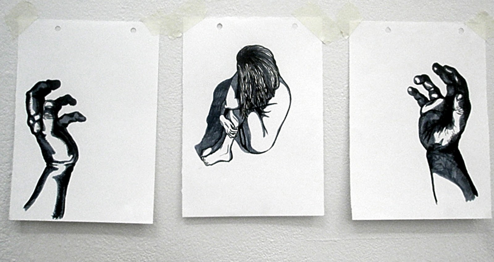
After much 'faffing' with my work, I had my one to one with Ian Chamberlain. These are the quick notes I took from that tutorial:
- Domestic Violence? More people can relate and have experienced.
Can also use my own experiences with it. - Can see my style of work in a Graphic novel/fanzine/printmaking.
- Look into current news rather than vague historical events e.g. Chikatilo.
- Perhaps take current event from newspaper and illustrate. e.g. M5 crash near Taunton.
- Or look into major historic events and adapt into comic form e.g 300/ From Hell.
- Keep a narrative.
With this tutorial I discovered I was at a bit of a crossroads with my work. I didn't really have a concept, other than keeping a narrative; I didn't really know where to move onto, although through my research I had discovered what I was interested in: control, power, and the edges of morality.
I will continue with research but perhaps keep too more contemporary and 'conventional' issues rather than serial killers.
Monday, 7 November 2011
Joint.
My last seminar at University on the 28th of October was partly useful, partly confusing.
I was told by my peers that the pencil drawing 'Captive' was too sexual, something I already knew. However, they made some valid evaluations about the small graphic/comic styled illustrations and confirmed what I had thought:
The last one I wasn't too keen on because it starts to lose a narrative when it is just of rope, however using an image of rope and juxtaposing it with another image appealed, and so I experimented with juxtaposition.
In the seminar, they also suggested going back to using pencil instead of brush pens and ink, however I enjoying using them far too much to go completely back to using just pencil.
While I thought of the comments my peers said were great and useful towards the techniques of my work, I didn't recieve anything helpful about the concept or undertone of my work, and so I am starting to feel a little lost about how to move on from the above.
I was told by my peers that the pencil drawing 'Captive' was too sexual, something I already knew. However, they made some valid evaluations about the small graphic/comic styled illustrations and confirmed what I had thought:
- A narrative/storyline is being read
- Small and frantic- adding to disturbing-more dark imagery.
- Colour adds more humanity- reds really grabs you- evokes danger quality.
- Undergrowth wrapping around victims- disappearing- buried = creepy.
- Which Side of the line am I looking at?
- Observational or experience.
- Control- not just physical, can be emotional.
- E.g. Domestic violence/abuse
- Juxtapose images- suggest rather than shout.
- Perhaps look at rope, tape and cable ties- again suggest with images of just rope instead of tied up women etc.
The last one I wasn't too keen on because it starts to lose a narrative when it is just of rope, however using an image of rope and juxtaposing it with another image appealed, and so I experimented with juxtaposition.
 |
| Rope. Draft. Nov 2011. |

 |
| Rope. Nov 2011 |

 |
| Shame. Nov 2011 |

 |
| Restrain. Nov 2011. |

Sorry about the image quality, the photographs were taken with the camera on my phone.
In the seminar, they also suggested going back to using pencil instead of brush pens and ink, however I enjoying using them far too much to go completely back to using just pencil.
While I thought of the comments my peers said were great and useful towards the techniques of my work, I didn't recieve anything helpful about the concept or undertone of my work, and so I am starting to feel a little lost about how to move on from the above.
Wednesday, 2 November 2011
Dead.
After continuing with my sketches about Chikatilo, using ink and my brush pens; I believe a narrative is beginning to arise slowly between and across the images. I am enjoying the graphic feel to the images, I believe the lack of complete graphic detail gives across a detached feel, making the illustration seem more cold and isolated.
The colours I have been using on the illustrations have also helped with the impact and mood given off with each piece. The blue/grey gives off a feeling of death to the bodies, a lack of life; the bright crimson skirt on the women gives the definite connotation of blood, and helps stimulate the feeling of death against the pale white skin.The black and brown ink helps lose the image in page, making the corpses almost disappear into the undergrowth, again bringing across the feelings of loss of life.
I think these images would work well as large litho prints, a small body lost within a large page of undergrowth, giving the feeling of being discarded and forgotten. More to be developed....
 | ||
| Dead. -Click for full image. |

 |
| Red Skirt - Click for full image. |

New Pens. New Style.

I found that after my first sketch (above) my style had almost completely changed. I don't believe my style changed wholly because of the pen, but that it helped manifest this change. I think the main contributing factor to this change is Craig Thompson.
A few weeks ago I purchased both Habibi and Blankets by Craig Thompson, I absolutely adore these books, both the artwork and the stories are beautiful. I heartily recommend them to everyone, whatever your interest is in books.
I believe the stories have influenced the way in which I now see narratives and the way my linework has progressed into something more graphic based than the mess it was before.I think I will continue working and developing in this way with brush pens because I enjoy the comic/graphic based element my work has now gained.
 |
| New hardback cover to 'Blankets' by Craig Thompson. |

 |
| Page Extract from 'Habibi' by Craig Thompson. |
Subscribe to:
Posts (Atom)