Showing posts with label Typography. Show all posts

Saturday, 20 April 2013

Charon Continuum

It's been a bit of manic day again today. Been doing a fair bit of design work for the Charon Continuum Project, which I'm part off.

Generally, I've taken a bit of an Admin/Organisational role for the project, but the website needed a bit of work to look nicer and we're in need of some posters and postcards to hand out for recruitment.

First, I sorted out the Wordpress site; it looked a bit of a mess. A little bit confusing, and not very user friendly. I changed the theme sorted out some settings, then I made a new header (below) for it.

I tried to make the header a bit Sci-Fi but also kind of 'trendy' and simple. I think it came out nicely considering I only done it all quickly this morning.


Now I'm working on the postcards/flyers to hand out at conventions and events this year. I'm trying to get at least one design completely finished before the start of May, so we can get them printed to hand out at the Bristol Comic Expo on the 11th-12th of May.

I've worked about 10 thumbnails so far, still need to do a few more, but I'm happy enough with one of the designs to carry on with for now.

It's a fairly simple design, copying the format of a newspaper, displaying both the subject of the first short story of the project and also all the needed information for new recruits and readers. Here's a screenshot of it in progress.


Monday, 16 July 2012

Aqualetes


Just moved back in with my parents after finishing University; found I needed to have a clear out of a some of my old Graphic Design A-level work to free up some space. Came across my Aqualetes Swimming club branding work and I decided to update them all, in order to add some more work to my portfolio and build it up some more. The results above are my new versions. I think they came out a lot nicer than the originals, thankfully.

Wednesday, 30 May 2012

End of Assessment, Start of show.


Assessment is over and done with now, so now it's the organisation of the end of year show. Walls are painted and everyones' work from my course is hung up. 

My work to be shown at the exhibition is not the final work I had for assessment but a stronger piece of work I had from before. The dull ache 'poster' I had before was really scrappy, however after cleaning it up and recolouring it on CS4 Photoshop, it has come out quite nicely, and really makes an impact on the viewer.  

I'll take some photographs of my work hung up in the exhibition and post them soon.

Wednesday, 9 May 2012

Experiment.


Picture 1 - Gesso and feathers on Somerset paper. 
Picture 2 - Mixed Media


Picture 3- Ink on Somerset Paper


Everything is getting a bit hectic at the moment, University deadline for assessment is getting closer, I've only got another week after this one and I'm still playing catch up at the moment, so this may be my last update for a while until everything has calmed down.

After doing colour tests, I decided to try using really feathers in my work (Picture 1). Although I liked the effect, it didn't quite work as strongly as my drawn feathers. So I moved off from that and tried a mixed media piece (Picture 2) , layering three sheets of tissue paper together. The front sheet just simply had the type on, the middle had feathers drawn on in ink, the back layer had photocopy transfers of real feathers.

I really liked this piece, however after my seminar I was told to revert back to drawing graphically rather than to continue with experimently with materials because I don't have the time between now and assessment to experiment to much.

Which I agree with, but I'm still glad I experimented, so I started drawing more graphically again and have also started working with a limited colour palette in inks, to try to help my work flow together rather than looking disjointed. (Picture 3) The last drawing is definately my strongest style in drawing, so I understand where my tutor is coming from.

Wednesday, 25 April 2012

Memory Poster Update.


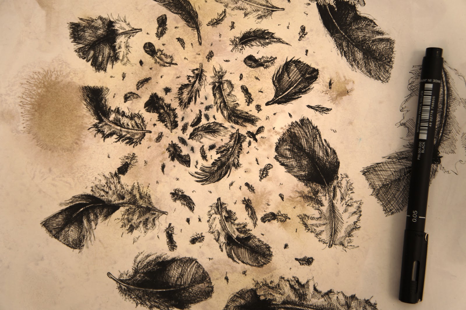
Been working and reworking some of my memory posters, above are just two that I quickly scanned in. Both are drawn by hand using fine liner pens; as I was drawing more of the posters I found the other memories were coming out far more graphically than my realistic feathers. So I ended up re-drawing them again; I think the result works a lot better, more of a powerful image and it works well in the series of posters I've started producing. Today I've photocopied the originals a few times to carry out some tests to see if they will work as well with ink washes and colours.

Saturday, 7 April 2012

Realistic Feathers


Got round to beginning the new section for my Universtiy project. I've started to mixing image and type on posters based around my memories of my Grandad. This particular one is based on the memory shown in the comic I drew back in one of my previous posts. I've never drawn feathers before, but I'm really happy with whats turned out; although I do feel they are a bit too realistic compared to my previous graphic styled imagery that I so loved. Perhaps I'll redraw them at a later date.

Thursday, 5 April 2012

Typography

University work has been pretty slow since Christmas, for personal reasons; but here's what my work progressed to following my presentation with my tutors.

I've seemingly moved back into my safety zone of 'Typography' which last week I was NOT happy with. However, after having a seminar Tuesday with my tutor, I've now started mixing images back with the type, which I am finding much more interesting to both look at and do. Not only that, but I am now also incorporating memories of my Gramps into new posters, rather than my original idea of Domestic Abuse; I'm finding these changes a lot more inspiring and motivating than my previous pathway of work. So YAY!